
Model Training Data Charts
About Model Training Data Charts
Model training is the process of filtering out bad data and bad tags and selecting healthy equipment behavior to be available for the state matrix. In the Smart Signal Maintenance module, you can view charts containing the training data associated with each tag in a model. These charts contain all data associated with the tag and include colored highlighting (also known as stripes) to designate which data will be used as training data.
Training Data and Training Data Filters
Ideal training data is a set of values over time that represent good or normal behavior for the equipment. Since the charts contain all data, colored highlighting (that is, stripes) is used to indicate whether certain data is normal or abnormal. Data indicated as abnormal (such as NaN values, flat-lines, and outlier values) is then excluded. Of the remaining data, some or all of it may be indicated as good data that should be included in the training data.
Data is identified as either normal or abnormal based on the following categories.
| Category | Stripe Color | Description |
|---|---|---|
| Adapted | Light green | Data auto-adapted into the model from runtime data processing. Note: If data that was imported via an .xfr transfer file contained auto-adapted data, that data is included the training data, but is not identified with the Adapted stripe on the charts. |
| Correlation | Orange | Data excluded via the tag correlation chart. |
| Exclude (Red) | Red | Manually excluded data. |
| Flat-Line | Light purple | Data excluded by autofilters due to unchanging data values. |
| Include (Green) | Green | Good or normal data, manually included as training data. |
| Mode Not Met | Gray | Data excluded where the mode condition was not met. |
| Nan (Not a Number) | Blue | Data excluded by autofilters due to data having a non-numeric or bad quality value. |
| Filter High/Low | Yellow | Data excluded by exceeding manual high/low filter limits. |
| Spike | Pink | Data excluded by autofilters due to a temporary step up/down. |
| State Matrix | Purple | Data being used to generate model estimate. |
You can select  to view a pane displaying a list of categories of data along with graphs depicting the percentage of data filtered per category, as shown in the following image.
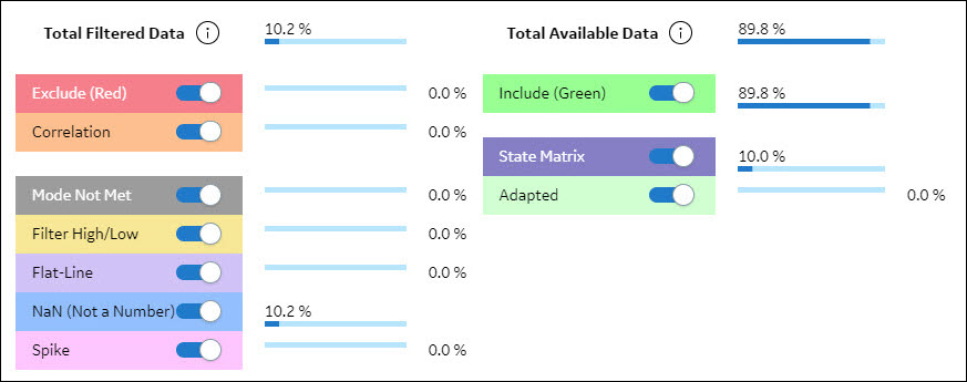
The categories that appear in the Total Filtered Data section represent categories of data that are excluded from model training. The percentages displayed next to them comprise a portion of the total filtered data. In the preceding image, for example, only one category of data was filtered, that being the 10.2% of data for the selected model that was identified as abnormal because the data was NaN.
The categories that appear in the Total Available Data section represent categories of data that are included as good or normal data for model training.
Stripes Behavior in APM
- Stripes automatically generated by the reference data selection algorithm based on your selection when you create a model, add training data to a model, or rebuild a model.
- Stripes that were manually specified in SmartSignal Maintenance in APM.
- Stripes that were specified in SmartSignal Classic Asset Center prior to importing the data into APM via a transfer center file.
- Filters are run to locate abnormal data and stripes are applied to exclude these vectors. The appropriate type of stripe is used to denote the reason that a vector was considered abnormal (for example, NaN).
- Training data vectors are selected.
- The state matrix is created using the selected training data.
After this process is completed, the training data charts reflect changes in data (in the case of adding training data) and changes in stripes due to filtering, training data selection, and state matrix selection.
The Model Training Data Chart Interface
The page for model training data charts provides a variety of user interface elements for navigating and modifying charts and chart data. The following tables present the available user interface elements along with their descriptions.
| User Interface Element | Description |
|---|---|
| You can use this button to view a pane that displays a list of available tags for the selected model. Output tags appear with a calculator icon next to them, while input tags have no calculator icon next to them. In this pane, you can select tags for which you want to display the training data charts. You can select the SORT TAGS BY TEMPLATE ORDER toggle button to sort tags in the order defined in the Analytic Template. You can use the SHOW INACTIVE TAGS toggle button to see the tags in the instance that are not associated with the model, and to determine whether you want to see only active tags in the model or instance. Inactive instance tags can be displayed only when the SHOW INSTANCE TAGS toggle button is selected. You can use the SELECT ALL ACTIVE MODEL TAGS toggle button to quickly select or clear all active model tags. Note: Any tag that is selected to display its chart will remain selected and will be visible in the tags list and charts until you clear the tag. This allows you to select the SHOW INACTIVE MODEL TAGS and SHOW INSTANCE TAGS toggle buttons without affecting the displayed charts.
| |
| You can use this button to view a pane that displays a list of available stripe filters. See the preceding Training Data and Training Data Filters section for more information on the available stripe filters for training data. |
| You can use this button to view a list of vectors. You can select an option in this list to display only vectors that meet certain criteria so that you can more easily understand and take actions on the available training data. | |
 | You can use this button to view a pane that contains the model tag statistics. This view allows you to search, sort, and filter the training data to find bad actors (for example, NaN, Filter High/Low, Spike, and Flatline). |
 | You can use this button to view a chart displaying the correlation of data between two tags. The correlation chart displays data in an alternative view to the line chart that can help you notice outlier data that might not be easily detected in the line chart. |
You can use this button to view a pane in which you can:
| |
|
Note: The following buttons are available in line charts and correlation charts. In line charts, each of the following actions is applied to all charts currently displayed.
| |
 | You can use this button to execute the filters for the model. This button is enabled only when the model filters are out-of-date and needs evaluation. |
 | You can use this button to rebuild the model. This button is enabled only when the model is out-of-date and needs to be rebuilt. |
| You can use this button to zoom in on the x-axis for a selected portion of the displayed charts. | |
| You can use this button to zoom in on the y-axis for a selected portion of the displayed charts. | |
 | You can use this button to zoom in on the x- and y-axes for a selected portion of the displayed charts. |
 | You can use this button to reset the zoom on the charts. |
 | You can use this button to expand or collapse all parameter editors for each visible training chart. |
 | You can use this button to undo changes made to stripes in the charts. |
 | You can use this button to redo changes that you had previously undone. |
|
Note: The following elements are only used in line charts.
| |
| You can use this button to select the previous set of tags and display the corresponding charts. | |
| You can use this button to select the next set of tags and display the corresponding charts. | |
 | You can use this button to select the next tag and add it to the bottom of the list of charts. |
 | You can use this button to remove the last chart from the list of charts. |
 | You can use this button to add or remove green stripes from charts for selected tags. Green stripes indicate good or normal data. |
 | You can use this button to add or remove red stripes from charts for selected tags. Red stripes indicate manually excluded data. |
 | You can use this button to change the size of the charts. You can select one of the following available sizes:
|
|
Note: The following elements are only used in correlation charts.
| |
| This button is referred to as a lasso. You can use this button to select data points that you want to exclude from model training. | |
 | You can use this button to determine which tags are displayed in the correlation chart. |
 | You can use this button to switch the axes on which the selected tags appear. |
| You can use this button to remove lassoed data points from model training. | |
| If you have previously excluded data points from a correlation chart, you can include them again by lassoing the region in which they appeared and then selecting this button. | |
Access Training Data Charts
In the SmartSignal Maintenance module, you can access charts displaying the training data associated with the tags in an analytic instance.
Procedure
- Select
 .A list of the tags associated with the model appears.
 - Select again to close the list of tags.A chart appears for each selected tag, displaying a graph representing tag data. Additionally, portions of the chart may include striping based on whether the data is identified as normal or abnormal.
Filter Model Training Data
In the page displaying training data charts for a selected model, you can filter the chart display in two ways:
- You can choose to display only vectors that meet certain criteria so that you can more easily understand and take actions on the available training data.
- You can hide certain stripes or stripe colors from the chart display in order to better distinguish other stripes.
These filters affect only the appearance of the displayed charts, not the data itself. The following two procedures explain how to use these filters in order to focus your view of the training data charts on the data that you want to see.
Filter Vectors Displayed in Charts
Procedure
- Select , select the tags for which you want to view charts, and then select again.The charts appear for the selected tags.
- Select
 , and then select one of the following options:
Option Description All Values in Instance (All Modes) Displays all values for all modes in the instance. All Values in Mode Displays all values for the selected mode. This option also hides vectors that are not excluded by the Mode Not Met filter so that you can focus on only the data that is in the mode of operation for the model. All Values Not Excluded Displays all values not excluded. In other words, this option hides all values that are excluded by any filter, including vectors manually excluded using red stripes. Reference Values Displays the chart values that are reference values. In other words, this option hides any vectors that are not manually included using green stripes. State Matrix Values Displays the chart values that are used in the state matrix. The chart display is filtered based on the selected option.
Hide or Display Stripes in Charts
Procedure
- Select , select the tags for which you want to view charts, and then select again.The charts appear for the selected tags.
- Select .
A pane appears, displaying a list of categories of data along with graphs depicting the percentage of data filtered per category, as shown in the following image.
- When you have finished modifying the displayed stripes, select .The pane is closed, and the chart display is updated to show or hide stripes based on your selections.
Filter Tag Data in Charts
In addition to using filters to modify the way the chart displays data and stripes, you can also configure filters in each displayed chart to automatically exclude regions of abnormal data. The following procedure explains how to use filters in model training data charts on a tag-by-tag basis to modify training data.
Procedure
- Select , select the tag for which you want to filter model training data, and then select again.A chart appears for the selected tag.
- In the chart heading, select
 .The tag statistics appear on the right side of the chart.
- When you have finished modifying filter values, select
 .
.
What To Do Next
Modify Training Data
In the page displaying training data charts for a selected model, you can manually specify which data you want to include and which data you want to exclude from consideration when building a model.
Procedure
- Select
 , and then select one of the following User Data Selection toggle positions:
Position Description Off This is the default position. When the toggle is switched to the off position, the SmartSignal auto-selection algorithm determines what to include as good or normal data. On When the toggle is switched to the on position, you can manually select which data to include in or exclude from the training data chart. Note: If you modify the User Data Selection toggle position for the training data chart for a model, the setting you select remains selected until you select a different toggle position.Important: If you switch the toggle to the on position and then later switch it back to the off position, when you rebuild the model, all of your manual data selections in the training data chart will be removed and replaced with selections generated by the SmartSignal auto-selection algorithm. - As needed, use the model training data chart interface options to navigate the charts and modify chart data.For example, if you want to add or remove green stripes, select, and the complete the following steps:
- To remove a green stripe, hover the cursor over the stripe that you want to remove.
The cursor changes, and the stripe is outlined, as shown in the following image.

Or, for example, if you want to add or remove red stripes, select, and then complete the following steps: - To remove a green stripe, hover the cursor over the stripe that you want to remove.
What To Do Next
Modify Tag Data in the Correlation Chart for a Model
The correlation chart displays data in an alternative view to the line chart that can help you notice outlier data that might not be easily detected in the line chart. You can use correlation charts to exclude this outlier data from model training.
Before You Begin
Procedure
- Select .A scatter plot appears, comparing values for the first two tags (alphabetically) used in the model.Note: The data points are color coded based on the colors used for data filtering, which you can view by selecting when you are viewing line charts. See the documentation on training data and training data filters for more details about filter colors.
- As needed, use the model training data chart interface options to navigate the charts and modify chart data.For example, to exclude data points from model training, complete the following steps:
- Select
 .
. - Select
 .The selected data points are excluded from model training.
- Select
- Optional: If you want to include data points that were previously excluded, lasso the area in which the data points previously appeared, and then select
 .Tip: To view excluded data points, use either the All Values in Mode or the All Values in Instance filter.The previously excluded data points are included in the correlation chart and are visible when you use the All Values Not Excluded filter.
Rebuild a Model
When you make changes to a model (for example, by modifying tag data or training data charts), you may need to rebuild the model in order for your changes to take effect. Complete the following steps to rebuild a model.
Procedure
Execute Model Filters
About This Task
Procedure
- Select .The execution of the filters begin and a progress bar appears, indicating the progress of the execution. After the filters are executed, the training data charts are refreshed to display the new filtering.