When you choose a column or field to be plotted on the y-axis, you must specify the side of the graph on which the axis will appear: left or right. You can do so using the options that are available in the Dimension Mapping workspace.
If you choose to plot more than one column or field on the y-axis and the values in those columns or fields vary greatly, using a right and left y-axis can improve the usability of the graph.
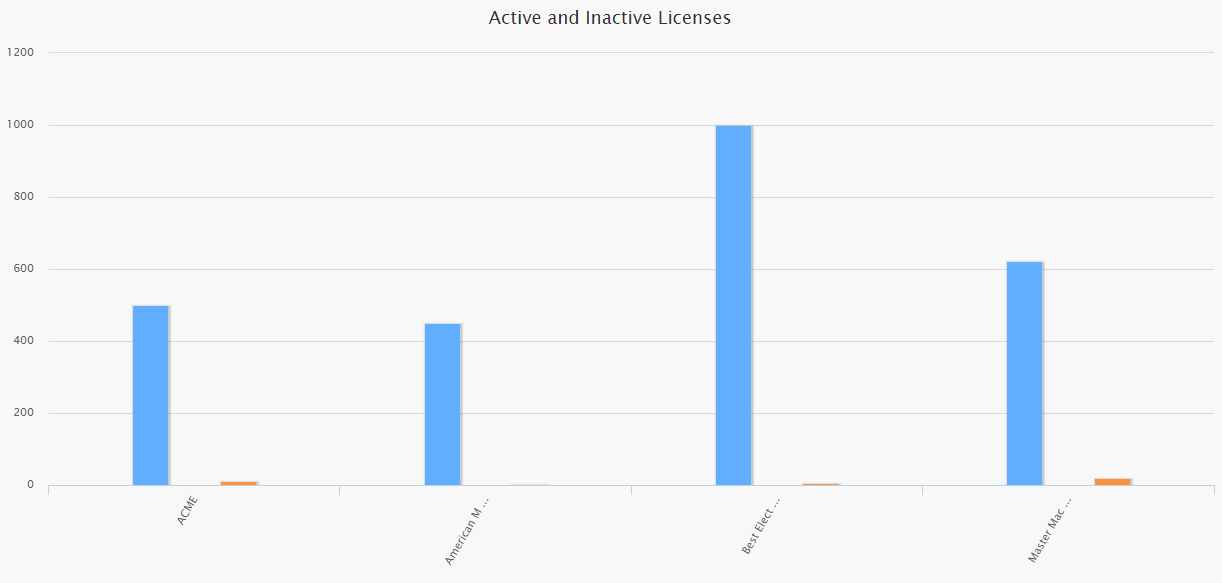
Consider a graph with the following underlying data:
| Manufacturer | Active Licenses | Inactive Licenses |
|---|---|---|
| ACME | 500 | 10 |
| American Motors | 450 | 3 |
| Best Electric | 1000 | 6 |
| Master Machinery | 623 | 19 |
In this example, if we plot a graph to display both the active and inactive licenses using only a left scale, the inactive counts are difficult to see. This is because the graph scale is based on the number of active licenses, which are much higher than the inactive licenses, as shown in the following image.
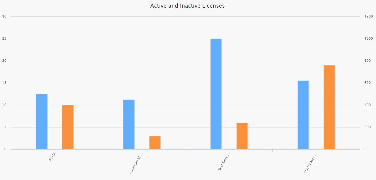
If, instead, we plot the active licenses on the left and the inactive licenses on the right, the bars for the inactive counts are easier to see. This is because the size of the bars has been adjusted according to a scale that is more appropriate to the size of the numbers, as shown in the following image.
Copyright © 1993-2015 Meridium, Inc. All rights reserved.