
Breadcrumb
The Breadcrumb widget provides a navigational trail that helps you track your location within an asset model hierarchy.
Breadcrumb navigation helps you access asset information from any level within the asset model hierarchy. It also defines relationships between different assets in the model. You can use breadcrumbs across various widgets in Operations Hub, including the Trend Card, where they allow navigation through different asset levels.
 and browse your model.
How to Navigate to the Widget
| Operations Hub New Layout | Refer to Visuals Tab for more information on the layout of widgets in Configuration Hub. |
| Operations Hub Classic Layout | Refer to About Widgets |
Breadcrumb Properties
| Field Name | Description |
|---|---|
| Source Asset Context | Select the source (asset name) for an asset context. The selected context
appears as a default breadcrumb view in the end application. This asset name
must exist in your asset
model.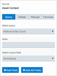 |
| Target Asset Context | Select the target for an asset context. This target defines where that
output goes on selecting an asset in a breadcrumb, so that it can be fed either
to a query or a global. |
| Extension Query for Asset Context Properties | Select the target for an extension query. This is a formatted string with
a list of properties that defines the hierarchy of the breadcrumb in the end
application. For example, consider these crumbs in a hierarchy - first is
‘pump’, second is ‘pump pressure’, ‘pump frequency’, ‘pump vibration’, or ‘pump
flow’.  |
Configuring Breadcrumb in a Flexbox Layout
- Use
Flex Wrap: This prevents the breadcrumb items from overlapping when the container resizes. - Set
Flex DirectiontoColumn: Arranging items vertically can help maintain readability in constrained spaces. - Separate Breadcrumb into a different card: Placing the Breadcrumb widget in its own container avoids conflicts with other widgets, such as the Trend Card.
Behavior and Limitations
The Breadcrumb widget's default color is black. If you apply a background color, its behavior depends on the layout settings.
When the layout is set to 100% height and width, the background color does not stay limited to the Breadcrumb, it extends across the entire card at runtime.