
Analysis Charts
About Analysis V2 Charts
Analysis V2 charts appear on cards contained in a view.
- You can save Alert Analysis and Analysis View charts as Analysis Templates.
- You can select multiple groups containing multiple charts.
- When you add a chart to an Alert Template, any triggered alerts appear in the Alerts module, where they can be examined.
- You can access public or private templates, or a new Time Series Analysis or Event Data Analysis view in the View Selector.
- You can access data related to assets that are not available in Essentials by importing the data. The data is then used to create tags.
- You can specify whether a template is public or private.
- You can specify whether a template is for an instance or a class.
- You can set the time zone, data resolution, data source, system of measure, and data quality of a chart. However, these settings are not available for SmartSignal charts.
- The default date range for an Alert Analysis is seven days before and after the event date. However, if the current date is earlier than the end date, the current date is considered.
- The default start date for a Time Series Analysis View is 15 days prior to the current date.
The selected configuration or the default value for the Time Zone ( ), Data Resolution (
 ), Data Source (
 ), System of Measure (
 ), and Data Quality (
 ) drop-down list boxes appears for each settings option. You can select different options in these list boxes. These options are not available for SmartSignal charts.
The Event Data Analysis View uses a selected number of events prior to a date and time selected by you to determine the time range for the selected event type. You can also select the number of seconds pre- and post-events to refine the amount of data surrounding the selected events.
As you plot tags for an Alert Analysis View or a Time Series Analysis View, a Plotted Tags list appears in the Plotted Tags section. The list appears as a hierarchy with nodes for cards and charts, and plotted tags or plotted tag series listed below.
Event Data Analysis view chart types are limited to Time Series, X-Y, or Polar charts. After you have selected the number of events for an Event Data Analysis view, added two tags, and selected View Data, an Event Frames list appears in the Tag Tree Browser that contains the number of events selected. Each event is identified by a date and time and is global for the all charts on the view. As you add cards and plot tags, a Plotted Tags list appears in the Plotted Tags section. Tags are represented below the main card node. You cannot manipulate tags in the Plotted Tags list. Muting and unmuting of data is controlled in the listed event frames, not the plotted tags. The Event Data Analysis View does not support multiple assets.
- Tag name
- Data point or value
- Unit of measure (UoM)
- Muted tags
- Show tag information.
- Configure analysis chart settings.
- Add a chart below the selected chart.
- Modify a chart.
- Arrange a chart.
- Selection of common chart controls such as zoom, cross-hair, and so on is applied across all the charts in a card and also across all the charts in any other card in the view. Any new charts added to the cards also retain the common chart controls selection made in one card. Deleting the chart or the card or moving to another card does not change the common chart controls selection. The sub configuration options of the common chart controls do not open for all the charts on which the selection is propagated.
- The common chart control selections are reset when you select another chart control outside the common controls and refresh the chart.
- When navigating to Analysis V2 from an Alert, the selection of common chart controls is retained on the charts.
- The selection of common chart controls is retained on the Event Data Analysis charts.
Create a Time Series Analysis Chart
Use Time Series Analysis to review data requests or to create new analysis view templates.
About This Task
You can add additional assets, add cards and charts, select a layout, change the date range, mute and unmute tags, plot tags, filter tags, plot tag expressions, and make other necessary modifications. You can plot up to 70 tags in a Time Series Analysis chart.
Procedure
About the Timing Diagram Chart
Using the Timing Diagram chart, you can analyze trends/patterns in data. It plots observations on the y-axis and time interval on the x-axis.
You can create a Timing Diagram chart from a Time Series Analysis template only. To create the chart, you must select the time range and add multiple tags. You can then compare multiple charts on the same card. The Plotted Tags section in the Tag Browser displays a hierarchy of the card, charts, and tags plotted on the chart in the view.
- Logical Overlay: Logical tags are plotted on Y-axis as a stack. Each tag appears as a straight line with a unique color to identify the tag from the tag register. However, tags with values other than 0 or 1 are represented in a step-up manner in the chart.
- Standard Overlay: Standard tags are plotted linearly
You can plot up to 40 tags on a chart, up to 20 of which can be logical tags. When you pause over a tag, the value of the logical tag appears in the tag register.
You can save the chart as a template.
Create an Event Data Analysis Chart
Use Event Data Analysis to review event data, or create new analysis view templates.
About This Task
You can save an Event Data Analysis view as a template, which can then be applied to an Alert Template, triggering an alert in the Alerts module.
The Event Data Analysis charts rely on the selection of an Event Type. Event Types are garnered from Alert Types, which are created for Alert Templates during tenant on-boarding.
Just as with Time Series Analysis charts, you can add cards and charts, select a layout, mute and unmute events, plot tags, filter tags, plot tag expressions, and make other necessary modifications. Event Data Analysis charts are event-frame-centric instead of tag-centric. Event Frames are the timestamped, prior instances of the selected Event Type. You can plot up to 70 tags in an Event Data Analysis chart.
You can select the number of events in the charts, determine the number of seconds prior to and after each event, and determine the date and time ending the event search to appear. The default ending time is the present date and time.
If you change any of the settings for the charts, you must select Update to make the changes in the charts.
- You cannot add multiple assets in the Tag Tree Browser, Tag Expressions or Search Browser panes.
- You can add up to 40 events per tag in an Event Data Analysis.
Procedure
Reorder Axes on a Chart
When you drag tags into a Parallel Axis chart, the order in which you plotted the tags matches the displayed order of the axes on the chart. You can change the order of the Y-axes after you have plotted at least three tags.
Before You Begin
Procedure
- Select
 , pause over a vertical axis on the chart, and then drag and drop it to a new location on the chart.All axes move over to accommodate the relocated axis.
Emphasize Data on Vertical Axes for a Chart
To manage tags, you can emphasize data on multiple chart axes, and select multiple areas on one axis to emphasize.
About This Task
Procedure
- Access the chart on which you want to emphasize data.
- Perform one of the following tasks:
- Access a previously saved Parallel Axis chart.
- Select , and then plot three tags.
- Select
 , and then drag over a selected portion of the vertical axis.
 - To select a data portion to emphasize:
- To enlarge or reduce the area, select one end of the selector box and drag to make the area larger or smaller.
Access Data Points on Charts
About This Task
Procedure
- Select
 , and then highlight the data points you want to access.When you select a period of time on a chart by marking a block on the chart, all the other charts in the card highlight the same period of time represented by the points selected on the chart. You can only highlight one chart at a time.
Filter Data Points on Charts
About This Task
Procedure
- Select .By default, the
 selection is enabled. Using this option, you can select data points on both the x-axis and the y-axis. Alternatively, you can select
  or
or  to select along the required axis only.
 - Select
 or
or  to include or exclude the selected data points in the visualization.Note:
- The filter options become active only when you select and apply either xy-axes, x-axis, or y-axis options in the chart.
- The highlights on the data points based on earlier selections in the chart are removed when you select filter-in or filter-out.
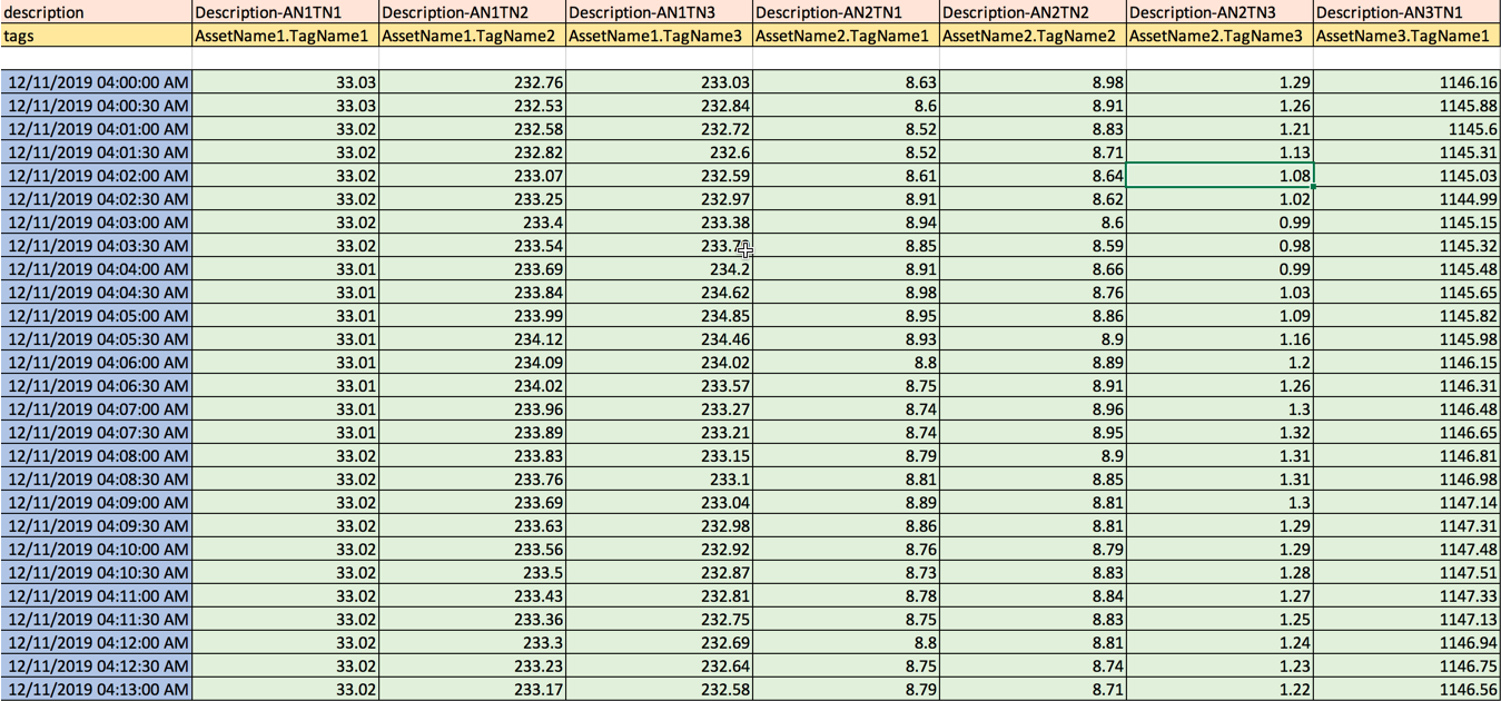
Upload a CSV file
About This Task
- Tag NameNote:
- The tag name can include special characters.
- Each AssetName can be combined with the TagName, for example G12.DWATT.
- Date and Time
- Data for each tag
- The file format must be .csv or .xlsx.
- The columns between the tag keywords and tag name must not be blank; all other columns can be blank.
- The Tags and description keywords columns must have the timestamps for the tag data in the column that follows the tags.
- The Tag column names must be prefaced with the keyword Tag/Tags.
- The UoM column names must be prefaced with the keyword Unit/Units.
- The tag description column name must be prefaced with the keyword Description.
- The keyword prefixed rows must be placed before the timestamp data rows.
- Rows with a NaN timestamp are not considered.
- For a blank or a non-numeric data row, the column data for the tag is considered as NaN.
Procedure
What To Do Next
- Plot charts using the tags to analyse the data for the virtual assets. You can only view the chart but cannot save it.
- Export the chart.
Delete a Chart
If you delete a chart, all tags, reference curves, and tag expressions unique to the deleted chart are removed from the plotted tags list.
Procedure
- Select
 .The chart is deleted and all its unique tags are removed from the Plotted Tags section.